

Jervis Bay and St Georges Basin, Shoalhaven, NSW


Meetings: 7:30pm
2nd and 4th Tuesdays of month
Vincentia Community Hall

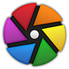
 The Bay and Basin Camera Club logo is a representation of a camera lens. The colours around the outside relate to colour photography, while the black and white centre relates to monochrome photography.
The black circle in the centre of the logo represents the area in which we are based - the Bay and Basin region of Shoalhaven Shire in New South Wales. The large and small circles cut from the black circle represent Jervis Bay and St Georges Basin, hence the name of our camera club. See the map below.
The coloured segments around the outside represent the iris blades of a camera lens. An image of an eight bladed iris is shown below, but the number of iris segments varies from camera to camera - the more segments, the more circular the aperture.
We have an eight bladed iris in our logo, with the eight colours of the iris being the seven colours of the rainbow which make up the colour spectrum of white light, plus grey to represent both a grey card or monochrome photography. Some of the actual colours are not technically accurate - their hue and saturation values have been adjusted to match the intensity of the other colours.
How our logo was designed
Our logo was designed by Brett Davis, our Vice President and Webmaster, in late 2008 during the early months of the Bay and Basin Camera Club. He describes the entire logo design process below.

|
The logo was always going to be based on a stylized iris, the part of the camera that controls the aperture. A lot of camera club logos have been based on the iris of a lens, including those shown below ... |

|
The BBCC logo design was inspired by the logo used by Google for its excellent Picasa image organizer and image editing application and its equally excellent photo-sharing website (both now discontinued). As you can see, the Picasa logo (left) is significantly different to our logo, and hopefully different enough to prevent the enormous multi-national corporation from suing our poor little camera club. The differences include; only 5 coloured "iris leaves" instead of 8, different sizes for the "iris leaves", the central blank area was meant to represent a house or home where you could put your photos, so there was no central black-and-white component and nothing representing the Bay and Basin area (as you would expect).
|

|
I took only one element from the Picasa logo - the red wedge - and used it for the basis of the new BBCC logo design. The first thing I did was flip it horizontally in Photoshop to make it a bit different from the Picasa red wedge. I also made it all a uniform red colour - for two reasons. One, it would be different from the Picasa red wedge, and two, it was easier! I also trimmed the edges to make the left edge exactly vertical, and the right edge exactly 45 degrees. |

|
I then duplicated the layer, rotated the new layer 45 degrees counter-clockwise, and moved it down and left until it was in just the right position. |

|
I repeated this process six more times until I had 8 red wedges. |

|
I figured that seven of the wedges should be the colours of the rainbow - red, orange, yellow, green, blue, indigo and violet - and I initially planned to make the eighth wedge black. But what shade of red should I use, or what shade of blue? Being a website designer who uses HTML to code web pages, I decided to use the colours designated by the HTML codes for each of the colour names i.e. red #FF0000, orange #FFA500, yellow #FFFF00, green #008000, blue #0000FF, indigo #4B0082 and violet #EE82EE.
The result - at left - was truly horrible! The orange was dull, the yellow too light, the black was too strong. |

|
I played around with the colours until I found a combination that I liked. Red, blue and indigo remained essentially the same, but the five other colours changed significantly. Orange became #FF6600, yellow became #EFCF00, green became #03AB00, violet became #91219F and I changed the black to grey. I figured 18% grey would be a good choice, as it is the standard grey used for light meters in photography, but finding the hex code was tricky. Apparently it depends on the gamma you are using on your monitor (or something like that), but #808080 was suggested, as was #707070 and #757575. I eventually liked and chose #777777. Most of these choices were totally arbitrary, so the likelihood of someone else choosing the same colours was extremely remote.
|

|
I figured the BBCC logo was complete, but it needed something in the middle of the lens. I love looking at logos, and one I really liked was the Peoplecare logo. The current logo (from 2017) is shown at left.
|

|
Back in 2008 the Peoplecare logo was a bit more stylized - something similar to the logo at left. I really liked the idea of a circle with circles cut out of it ...
|
|
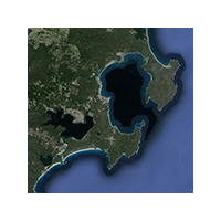
While I was developing the BBCC logo and designing the BBCC website, I took a look at the Bay and Basin area on Google Earth with a view to adding a Google Map of our meeting place. It looked like the image to the left.
|

|
I immediately pictured the "circle with circles cut out of it" idea, and decided to use a black circle to represent the Jervis Bay and St Georges Basin area, with two white circles cut out of it to represent the Bay and the Basin. I chose black and white because of its obvious historic association with photography.
|

|
I added the black circle with the two circles cut out of it to the rest of the logo, and the logo was complete ...
|

|
... but I later added some drop shadow because I liked the effect.
|
Since it first appeared on our website in late 2008 or early 2009, the BBCC logo has been ripped off, stolen, copied and modified by a number of individuals, businesses and organisations in Australia and around the world, all without seeking our approval or acknowledging the source of their logos. Of course, some may have been unaware that our logo is the intellectual property of the Bay and Basin Camera Club Inc ...
A page showing the web pages of those who are using our logo can be found here - Sites that have stolen our Logo.
If you find your website listed, you might like to consider changing your logo ...